Comparing SFS_CODE to Coalescent and Poisson Random Field Expectations
The demographic model (described in words) is as follows: The ancestral human population expanded 1.8-fold 0.63×2Na generations ago (where Na is the ancestral effective population size). Then, 0.27×2Na generations ago, the European population left Africa with an effective population size just 0.15×Na. After another 0.21×2Na generations, the European population went through another 2-fold bottleneck, but has since been recovering with exponential growth. This model has complicated dynamics, with multiple size changes, making it very useful for comparing SFS_CODE to ms. The command-lines for this demographic model are rather large, with both SFS_CODE and ms commands consuming 2 lines of text.
sfs_code 2 15000 -n 10 -r 0.001 -TS 0.359 0 1 -TE 0.629 -Td 0 P 0 1.815
-Td 0.359 P 1 0.158 -Td 0.566 P 1 0.523 -Tg 0.566 P 1 49.492
ms 40 15000 -t 5 -r 5 5000 -I 2 20 20 -ej 0.134 2 1 -n 1 1.815 -n 2 3.369
-eg 0 2 99.071 -en 0.031 2 0.286 -en 0.314 1 1
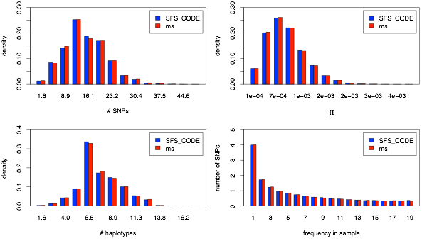
First I show plots akin to the 1-population analysis, with the marginal number of SNPs (upper left), π (upper right), number of haplotypes (lower left) and marginal site-frequency spectrum for a given population (lower right). First up: YRI population.
7/25/08
For the two-population comparisons, I will focus on a single demographic model, with and without migration. The demographic model corresponds to a preliminary analysis by Ryan Gutenkunst of the NIEHS SNP data corresponding to the YRI (Yoruban), CEU (European), and ASN (Asian: Chinese/Japanese) populations, but excluding all dynamics associated with the ASN population. This demographic model is only used for demonstrative purposes, and should not be used for any subsequent studies (as it is unpublished, and just extracted from the 3-population analysis).
As with the 1-population comparisons, I will look at the distribution of the number of SNPs, π, number of haplotypes, and site-frequency spectrum in each population, but I will also look at the joint frequency spectrum. These statistics will allow me to show that divergence times and migration rates are all scaled properly.
Neutral Models: 2 populations
-
1.No migration
-
2.With migration
Finally, I add migration to the two population dynamics. Rather than include a constant rate of migration throughout the demographic history, however, there are two phases. Immediately after the split of the two populations, there is limited migration. However, after the second bottleneck, the migration rates increase. Both commands are presented here for completeness.
sfs_code 2 15000 -n 10 -r 0.001 -TS 0.359 0 1 -TE 0.629 -Td 0 P 0 1.815
-Td 0.359 P 1 0.158 -Td 0.566 P 1 0.523 -Tg 0.566 P 1 49.492
-Tm 0.359 P 0 1 6.340 -Tm 0.359 P 1 0 1.00186 -Tm 0.566 L 0.759 0.0628
ms 40 15000 -t 5 -r 5 5000 -I 2 20 20 -ej 0.134 2 1 -n 1 1.815 -n 2 3.369
-eg 0 2 99.071 -en 0.0314 2 0.286 -en 0.314 1 1 -ma x 0.837 0.837 x
-ema 0.0314 2 0 6.985 6.985 0
I now show figures that are equivalent to the ones above, but for the case of migration. First the marginal YRI dynamics.
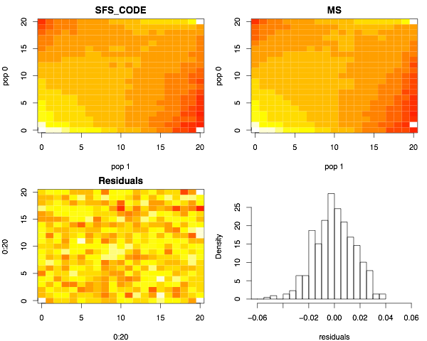
Finally, the joint site-frequency spectra for the case of migration.
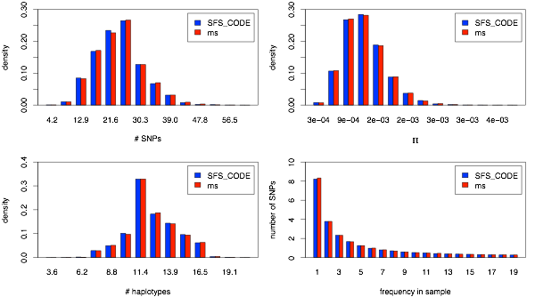
Next, I show the same plots for the CEU population.

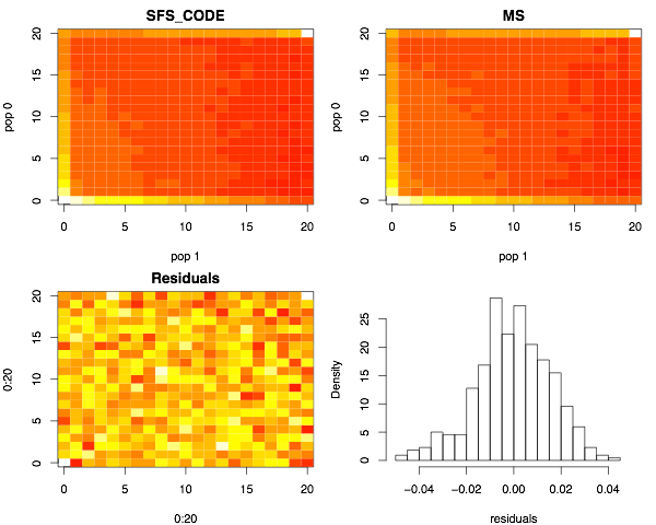
Next I show the joint site-frequency spectra. The top two panels show the number of SNPs (colored using a heat-map) at frequency (i,j), indicating that i chromosomes from the YRI sample and j chromosomes from the CEU sample carry the mutation (0 ≤ i,j ≤ 20). The lower left panel shows the distribution of the residuals (SFS_CODEi,j - msi,j)/sqrt(SFS_CODEi,j). The lower right panel shows the distribution of residuals. Note that they are centered about zero, which largely indicates that the two programs are generating equivalent results. Note that slight color differences in the two upper panels indicated slightly different cutoffs used by the image function in the R statistical package.

Now the marginal CEU dynamics.